Vertical

Symbol

Horizontal

Powered by Morpho
Static assets


Embed with web component
Load and embed in your app
<!-- Powered by Morpho badge Web Component -->
<script src="https://my-website.com/snippet.js"></script>

<!-- placement: "center" or "bottom-left" or "bottom-right"
or "top-left" or "top-right" -->
<powered-by-morpho
  theme="dark"
  placement="center"
>
</powered-by-morpho>Colors
Our signature blue and black hues are inspired by the captivating
Morpho butterfly. These fundamental colors shape our brand's
identity, signaling trust and innovation.
Neutral
Dark Base
800
700
600
500
0
Blues
Blue Base
Blue Light
Gradients
Gradient
Typography
FK Grotesk represents a rigid typeface with an innovation and engineering appearance, suitable for both small text and large headlines. Subtle ink traps and sharp corners provide distinctive and eye-catching detail at large point sizes.
Main font
FK Grotesk
LightRegularMedium
Labels
FK Grotesk SemiMono
RegularMedium
Details
Details
Illustrations
Abstract Shape
This abstract shape is the pillar of the brand, its main symbol and
the most frequently used, with nuances of blue, evokes fluidity and
harmonious movement. It elegantly symbolizes Morpho's constant
evolution and its desire to remain at the cutting edge of innovation.
Secondary illustrations
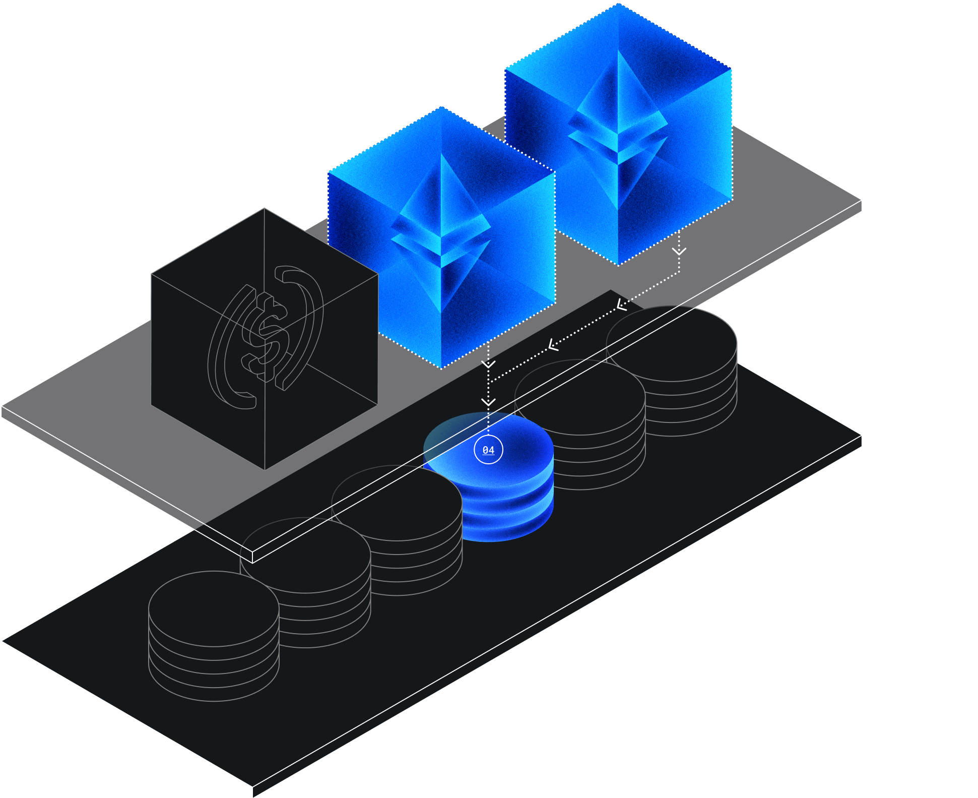
These illustrations are used alongside the primary shape to depict certain
topics with greater precision. These 3D visuals, composed of grain style and blue shades and gradients, add a unique dimension to our social media and website, helping to communicate our message with visual impact.


Icons
Our icons are minimalist, designed with clean lines and a subtle color palette
to ensure visual clarity and consistency across our digital platforms.
They seamlessly blend to improve the user experience.


